


Issue 74. I changed my mind about color analysis
What we can learn & what we can leave behind

I used to be an evangelist for color analysis.
Early on in my Substack journey, I wrote two posts about how discovering my ‘best colors’ improved my life and style. I even started building a real-life color analysis business: I came up with a name, bought a domain, designed a website, and began training myself in the seasonal system. Maybe you remember when this newsletter was briefly called Clear Day…
But as the concept of Intuitive Style grew organically through my writing, I began to see that running a professional color analysis business could be at odds with something that matters even more to me than color theory: empowering other people to trust their own intuition. To validate their own preferences, no questions asked.
So, I stopped. I relegated my handmade color swatches to a Trader Joe’s bag. I changed the name of this newsletter. I self-produced an 18-episode podcast about personal style. I shifted my energy elsewhere.
But I almost never throw the baby out with the bathwater, so today I’ll share the things I did learn from color analysis, and what turned me off.
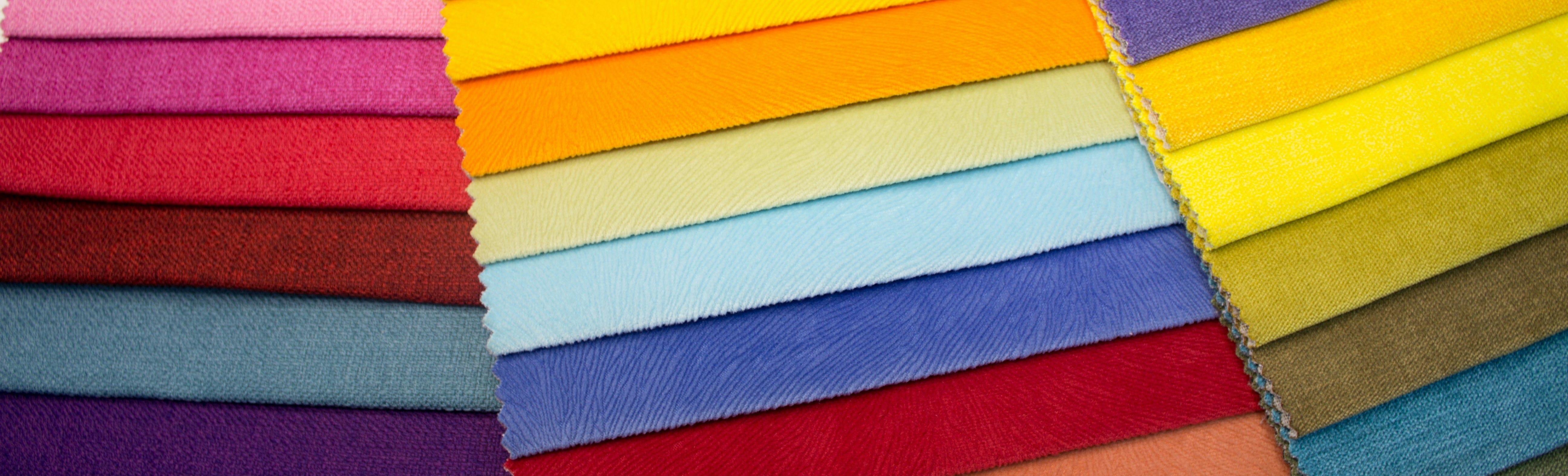
THE GOOD
It’s supposed to look different on me
Some of the people whose style inspires me most don’t look like me.
Before I discovered color analysis, I’d copy my favorite creators—same outfit, same colors, and then wonder why it didn’t have the same effect on me. In hindsight, this feels obvious!! But to my influencer-addled brain, this was a shock!
The most useful thing color analysis taught me was that a color or combination might look completely different on me than it does on someone else — and that’s okay.

These days, when I’m inspired by someone else’s look, I know that I’m going to have to tweak it! For example, when I re-created a stranger’s look, the final look included aspects from the original combined with things I already had.
THE NOT-SO-GOOD
Color analysis isn’t neutral.
While color analysis offers useful insights, it also reflects and reinforces aesthetic biases we’ve absorbed from culture.
Color analysis seek to find ‘harmony’ between your features and the colors you wear. And while my color analysis results served up colors that are harmonious with my coloring—including crisp blues and whites—these colors also carry deep associations with privilege, whiteness, and exclusivity. That’s not a coincidence. These colors are seen as “professional” or “elevated” in part because they’ve long been worn by people in positions of power—doctors, lawyers, corporate leaders—who were, for much of history, predominantly white, like me.
What does it say about color analysis when certain people’s results recommend they wear colors associated with power and wealth—while others are assigned palettes linked to sensuality, emotion, or chaos?
For example, I'm trying to challenge my internalized association with dark hair as being more “edgy,” “striking,” or “sultry.” Or the idea that I’m not particularly “sexy” because I have pink cheeks and light hair, more like a cherub than a vixen.
Because who gets to decide what “sexy” or “edgy” looks like?
So many of our ideas about what’s chic, soft, elegant, or cool are shaped by media and cultural associations—not just color theory. And often, those associations are racialized, gendered, and deeply engrained.
I don’t know if the creators of color analysis intended to uphold class structures. But the version of the system I’ve encounter certainly hasn’t addressed these biases either.
And yet, we get to make aesthetic choices based on our own experience. That’s something I talked about with
on the Intuitive Style podcast — the importance of questioning the expectations placed on us without turning every preference into a political statement we have to justify.Laura shared:
[There’s this] expectations that Latin women need to dress certain way, or they need to look certain way, or you don't dress ‘Latin enough.’ Well, what does that [look like]? What is that? What is Colombian aesthetic? What is Latin aesthetic? Is it something you saw on the TV? Is it that you created from seeing Salma Hayek in movies?
Because it's not a monolith. Being a Latin woman is so many things, including what I am choosing to do. It's important to question where our choices are coming from, but then we make peace with those answers. We don't need to try to change them, just to appease certain discourses, such as the class or the race discourse.
In your case, you don't like [how bright color looks on you], and it doesn't mean you're racist or classist, or that you're trying to, I don't know, ‘assert your whiteness.’ It's just simply that you don't like how you look in color! And that's totally okay. It's an aesthetic choice. And we are free to make those aesthetic choices.”
What we choose to wear is part of who we are—not all of who we are.
So, what do I think about color analysis now?
I see it as an imperfect system that, whether intentionally or not, reflects cultural and societal hierarchies—and sometimes distracts us from centering our own preferences. But that doesn’t mean it’s without value. If we choose to use color analysis, we can do so thoughtfully, with a grain of salt and greater cultural awareness.
I’ll wrap up with a few questions:
When we follow color analysis “rules,” what are we really following? Are we celebrating our individuality — or measuring it against a standard shaped by culture, privilege, and proximity to power?
Whose definition of “natural” are we using when we say color analysis seeks to bring our our “natural beauty?” And if it’s not our own definition—what would it feel like to trust ourselves instead?
Are there other internalized rules we’ve accepted about ourselves—beyond color and style—that we might begin to question? What might change if we gave ourselves permission to challenge them?
That’s all for today! Thank you for reading.
I got the book from the 80s from the library and wish I would have just took what I wanted from that and not spent the money on an appointment. I think it was $300 🫣
I always say- it’s just another tool in our toolbox but maybe it shouldn’t define us…which is such a great way of thinking about color like you’ve pointed out here!